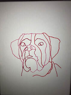
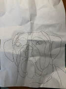
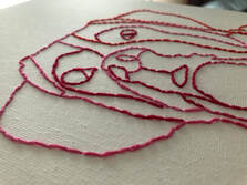
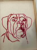
For this week's piece I decided to do an artist's choice piece. This was actually a gift to my mom for mother's day. I wanted to give her something unique but still personal and simplistic, so I decided to stitch a picture of my dog onto a canvas. I first took a piece of paper and used a photo of his to get the proper outline I needed. Then I put it on the canvas and poked holes along the lines to create the same shape in the canvas. And finally I took some string and took it through the holes as I would if I was embroidering something. This process took me about three hours in total to complete as it was a pretty tedious process but I think that it was quite relaxing and enjoyable. I was considering adding some sort of border to this piece so that it didn't look so plain and incomplete but I couldn't settle on what to add so I left it as it was. But I think that I will definitely get back to it in the future to add something to it. Overall, I am actually pretty happy with how this piece turned out and I want to try making more pieces with the same method in the future.
|
|
|
|
|
|
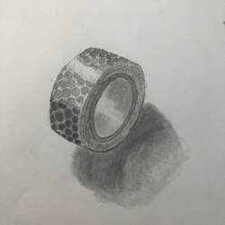
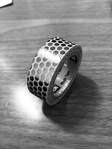
This is an observational drawing that I completed this week. I wanted to try and draw this tape roll because I thought it would be challenging to draw all the shapes in it. I used a few different graphite pencils to create multiple values in this piece. This isn't my favorite piece as I feel like there a few errors that could've been fixed if I had spent some more time on it. The shape could've been fixed to look a little cleaner and more proportional, I could've blended more to make it less streaky, and the shadow could've been cleaned up a bit too. I also should've added a line to mimic a surface for the tape to sit on, which would bring the piece together. a I do think that I did a pretty good job of adding some texture to this piece. I added several lines to make it seem like a roll of tape and I think the highlights and shadows helped to make it seem as if it were shining, which made it seem more realistic. Overall, I like this piece and I think that I'll end of revisiting it in the future to add on to it and make it better.
|
|
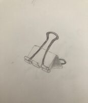
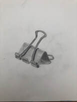
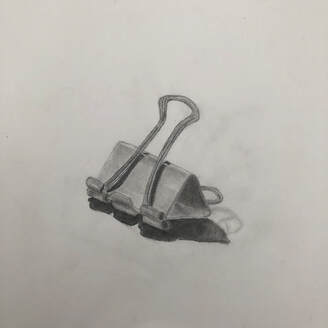
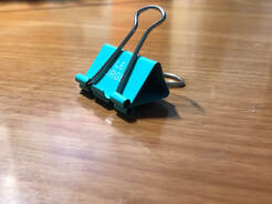
This week I decided to complete an observational drawing. I decided to try drawing a binder clip since there are two different materials that I thought could be difficult to draw, and I wanted to challenge myself so I could improve my drawing skills. For this drawing, I just used regular graphite pencils, and a little white charcoal for the highlights. It took me quite a while to get the main shape of the clip sketched out because I couldn't get it to be proportional, but I eventually did. I spent a lot of time shading to create all different values on this piece, which I feel gave it a lot of dimension and made it look more realistic. I feel that I could've spent more time on the metal loops to make them look more realistic. I also could've spent more time on the clips to make them look smoother and less streaky. I think that that edges of the clips are pretty well blended which I think is because they were easy to blend due to their small shape. Overall I think the work I put into this drawing payed off and I'm really happy with the result.
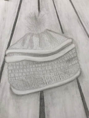
In this unit we learned how to incorporate value and composition into our drawings. The media I chose for this drawing was graphite because I love using different weighted pencils to create various shadows throughout my drawing, which I feel makes it look more interesting. While I was working on this piece I had an issue with the tiny details of the knitted hat, so I put tiny shadows all through the drawing to mimic the curves of each woven strand of the hat. I think that I was able to show composition well as my drawing does run off the page. I feel that the most successful part of my work is the upper half of the hat, I feel like a was able to use the value scale pretty well there and I am very happy with how it ended up looking.
|
|
|
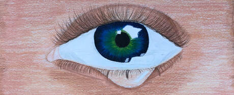
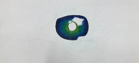
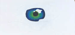
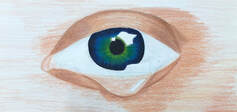
This was one of the explorations I completed. The media I chose was colored pencil. With this piece I was able to experiment with different colored pencil techniques. I had to closely apply a certain amount of pressure on the pencil depending on how dark/opaque I wanted the area to be. I had to go over the same areas several times to make the piece look much more blended.
To make the teardrop look more realistic and made sure to make the skin on the inside lighter than the rest of the drawing and added highlights and shadows to give it a 3D effect. Similarly, I made sure to add lots of highlights and shadows to the iris of the eye to add dimension to the piece. To ensure that the shape wouldn't get messed up, I originally drew out the main shapes of my drawing on the paper with a regular pencil to act as guidelines for my final piece. This step was crucial to making the drawing look more realistic and neat. I definitely feel like the skin could've used some more work because the end result seems pretty splotchy and not as smooth looking as I would like it to be. The eyelashes on the bottom are a little sloppy and I feel that if I had spent a little more time prior to the final piece planning out how they should have been placed, I would've been able to avoid the problem I ended up facing. I think the iris of the eye turned out quite well at its blended well and looks fairly realistic. I think that using a mix of vibrant and neutral colors really helped to make it stand out and made it much more interesting to look at. This piece definitely took the longest out of all the explorations but its also my favorite piece out of all of them, and I'm actually very happy with the final result.
To make the teardrop look more realistic and made sure to make the skin on the inside lighter than the rest of the drawing and added highlights and shadows to give it a 3D effect. Similarly, I made sure to add lots of highlights and shadows to the iris of the eye to add dimension to the piece. To ensure that the shape wouldn't get messed up, I originally drew out the main shapes of my drawing on the paper with a regular pencil to act as guidelines for my final piece. This step was crucial to making the drawing look more realistic and neat. I definitely feel like the skin could've used some more work because the end result seems pretty splotchy and not as smooth looking as I would like it to be. The eyelashes on the bottom are a little sloppy and I feel that if I had spent a little more time prior to the final piece planning out how they should have been placed, I would've been able to avoid the problem I ended up facing. I think the iris of the eye turned out quite well at its blended well and looks fairly realistic. I think that using a mix of vibrant and neutral colors really helped to make it stand out and made it much more interesting to look at. This piece definitely took the longest out of all the explorations but its also my favorite piece out of all of them, and I'm actually very happy with the final result.
|
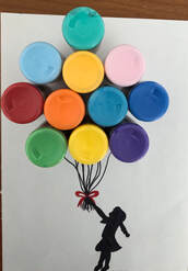
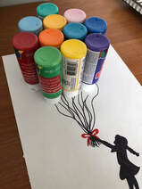
This is the everyday object art I decided to do for this week. I noticed a bunch of paint bottles sitting around and all the different colors inspired me to create this balloon drawing. To start this piece I laid out the paint bottles upside down in a shape that made it look as if there was a bunch of balloons. Then I drew the little strings coming down from the bottles and the little girl. I decided to just leave the girl as a silhouette so that the main attention could be on the balloons. I made sure to outline where I wanted everything to be first so that I could avoid making a mistake when going over it with marker. I think that if I were to redo this piece, I would be more mindful when placing everything out because I feel like the image it a little lopsided and I could definitely improve that. Overall, I'm pretty happy with how this piece turned out and I am a fan out the simplicity of it even though there are a few errors.
|
