
|

|

|

Four Assessment Drawings:
For this assignment, the task was to create four very different drawings: a monster, a portrait, a building in 2 point perspective, and a hand. The purpose of this was to portray my drawing skills so that strengths and weaknesses can be pulled out. For my monster, I think that my approach was good, however, it would've looked better if I took more time to blend out harsh lines and create a more detailed background. Portraits have never been my strong suit, but I have always enjoyed drawing eyes. I think that I need to work on proportions when it comes to drawing a face, and learn how to blend out features a little better so that the face can look more realistic. For my building in two point perspective, I like the window that I drew but I think that overall the lines could be cleaner and more proportionate and the shadows could've been placed more precisely. Finally, for the hand, I tried to draw my own hand as best as possible. I think that if I took more time with this drawing to really blend it out and carefully place each feature, the outcome would've been much better. Overall, this assignment helped be get a better understanding of where I'm at in terms of my drawing skills, and what aspects I should try to focus more on in the future.
For this assignment, the task was to create four very different drawings: a monster, a portrait, a building in 2 point perspective, and a hand. The purpose of this was to portray my drawing skills so that strengths and weaknesses can be pulled out. For my monster, I think that my approach was good, however, it would've looked better if I took more time to blend out harsh lines and create a more detailed background. Portraits have never been my strong suit, but I have always enjoyed drawing eyes. I think that I need to work on proportions when it comes to drawing a face, and learn how to blend out features a little better so that the face can look more realistic. For my building in two point perspective, I like the window that I drew but I think that overall the lines could be cleaner and more proportionate and the shadows could've been placed more precisely. Finally, for the hand, I tried to draw my own hand as best as possible. I think that if I took more time with this drawing to really blend it out and carefully place each feature, the outcome would've been much better. Overall, this assignment helped be get a better understanding of where I'm at in terms of my drawing skills, and what aspects I should try to focus more on in the future.

9 Compositional Photos:
For this assignment, the task was to find an object that I was interested in and take 9 different photos using the three different types of composition (rule of thirds, golden spiral, and symmetrical). The purpose of this was to change my perspective for photographs and how I view an object. I chose to photograph my sunset lamp, which I find to be a simple, but visually appealing object. I tried to capture all the prominent features of this lamp through taking these photos from different angles. My favorite two photos are highlighted with yellow boxes. The left most photo was taken with the golden spiral composition while the one highlighted to the right was taken with a symmetric composition. These are my favorites because I love the way that they capture the intriguing colors that the glass dome of the lamp reflects, but also maintain a simple and clean look to the photos.
For this assignment, the task was to find an object that I was interested in and take 9 different photos using the three different types of composition (rule of thirds, golden spiral, and symmetrical). The purpose of this was to change my perspective for photographs and how I view an object. I chose to photograph my sunset lamp, which I find to be a simple, but visually appealing object. I tried to capture all the prominent features of this lamp through taking these photos from different angles. My favorite two photos are highlighted with yellow boxes. The left most photo was taken with the golden spiral composition while the one highlighted to the right was taken with a symmetric composition. These are my favorites because I love the way that they capture the intriguing colors that the glass dome of the lamp reflects, but also maintain a simple and clean look to the photos.
Collage

Cut Paper Composition:
For this assignment, the task was to create a collage piece that was. For my piece, I used colored construction paper. Initially I was going to create an eye out of paper with a colorful iris. However, it did not end up looking the way that I wanted so I decided to go for a completely different approach by incorporating geometric shapes. I kept the colors simple by using primary colors and tried to keep the lines in my piece really clean. Finally, I included my eye element through a small pencil sketch. Overall, this is not my favorite piece. I think that it is interesting to look at but for the next time, I think I should plan more for this piece so that it ends up looking the way I want it.
For this assignment, the task was to create a collage piece that was. For my piece, I used colored construction paper. Initially I was going to create an eye out of paper with a colorful iris. However, it did not end up looking the way that I wanted so I decided to go for a completely different approach by incorporating geometric shapes. I kept the colors simple by using primary colors and tried to keep the lines in my piece really clean. Finally, I included my eye element through a small pencil sketch. Overall, this is not my favorite piece. I think that it is interesting to look at but for the next time, I think I should plan more for this piece so that it ends up looking the way I want it.
Brainstorming Collage Ideas:
Northern Lights, Iceland
Moraine Lake, Canada
Bora Bora waters
Cannon Beach, Oregon
Nags Head Beach, NC
Santorini, Greece
Mykonos, Greece
Hawaii Mountains
Mt Everest
Cape Town
Mountains in Alaska
Venice, Italy
Capri, Italy
Mt Fuji
Northern Lights, Iceland
Moraine Lake, Canada
Bora Bora waters
Cannon Beach, Oregon
Nags Head Beach, NC
Santorini, Greece
Mykonos, Greece
Hawaii Mountains
Mt Everest
Cape Town
Mountains in Alaska
Venice, Italy
Capri, Italy
Mt Fuji

Collage Color Sketch:
This is the sketch that I will base my collage on for my final collage piece. The point of this piece was to get an idea of how I want my final piece to look. This helped me understand what colors I will need for my final piece so that I can start planning out the elements for my collage. |

Reference Photo
|

|

|

|
Progress #1 Progress #2 Progress #3

Final Collage:
I chose to use a photo of a sunset at Mt Fuji because I really liked the different colors that were present. I wanted to try to depict the way that those colors blend together in the sunset. I feel that the accuracy of my proportions, values, and shading could be better as the slant of my mountain is much steeper than the actual photo. I think the shadows are decent, however, I think it would've looked a little bit better if I had tried to blend the reflection of the mountain with the reflection of the sky to mimic the look of water. I really like how the colors of the sky blend together in my collage and I think that I was able to achieve this effect by using small pieces. I used texture by using different shapes and sizes of magazine paper. The pieces in the sky are a little smaller and randomly shaped while the water pieces are more rectangular. This was meant to create a contrast between the two major sections of my piece. I wanted to use smaller and more random pieces for the sky to lay out the various colors of the sunset. I found that this technique was beneficial toward creating a blended sky. I wanted to use more rectangular pieces for the water to create a stretched out version of the sky that would depict a reflection in water. For my mountain, I chose to use more symmetrical pieces to make the space feel cohesive. I think that I did use a full range of values to reproduce my photo reference. The reflection of the mountain in the water really helped to create the perception of foreground, middle ground, and background. The tip of the mountain reflection represents the foreground, the mountain itself represents the middle ground, and the sky acts as the background. I think that my piece was decently executed. There are a few mistakes here and there but overall I feel that I was able to create clean lines that do not clash together. If I were to redo the project, I would take more time to work on the water, particularly the reflection of the mountain. That portion seems to stand out and does not seem to blend with the rest of the piece the way I would like it to.
I chose to use a photo of a sunset at Mt Fuji because I really liked the different colors that were present. I wanted to try to depict the way that those colors blend together in the sunset. I feel that the accuracy of my proportions, values, and shading could be better as the slant of my mountain is much steeper than the actual photo. I think the shadows are decent, however, I think it would've looked a little bit better if I had tried to blend the reflection of the mountain with the reflection of the sky to mimic the look of water. I really like how the colors of the sky blend together in my collage and I think that I was able to achieve this effect by using small pieces. I used texture by using different shapes and sizes of magazine paper. The pieces in the sky are a little smaller and randomly shaped while the water pieces are more rectangular. This was meant to create a contrast between the two major sections of my piece. I wanted to use smaller and more random pieces for the sky to lay out the various colors of the sunset. I found that this technique was beneficial toward creating a blended sky. I wanted to use more rectangular pieces for the water to create a stretched out version of the sky that would depict a reflection in water. For my mountain, I chose to use more symmetrical pieces to make the space feel cohesive. I think that I did use a full range of values to reproduce my photo reference. The reflection of the mountain in the water really helped to create the perception of foreground, middle ground, and background. The tip of the mountain reflection represents the foreground, the mountain itself represents the middle ground, and the sky acts as the background. I think that my piece was decently executed. There are a few mistakes here and there but overall I feel that I was able to create clean lines that do not clash together. If I were to redo the project, I would take more time to work on the water, particularly the reflection of the mountain. That portion seems to stand out and does not seem to blend with the rest of the piece the way I would like it to.
Pen and Ink

|

Pen and Ink Value/Stippling Practice:
For this assignment, I had the fill out these two worksheets using a sharpie pen. The purpose of these activities was to help me practice my skills with creating value. I think I did a pretty good job with this assignment, however, I feel that I could have been a little bit neater with the cross hatching and stippling. |

3 Texture Video Drawings:
For this assignment, I had to watch three tutorials and do my best to follow them. The purpose of this assignment was to practice creating different textures with pen and ink by applying them to variously shaped objects. I think this assignment helped me gain a better perspective of how to work with values and lay down patterns to create depth to a drawing.
For this assignment, I had to watch three tutorials and do my best to follow them. The purpose of this assignment was to practice creating different textures with pen and ink by applying them to variously shaped objects. I think this assignment helped me gain a better perspective of how to work with values and lay down patterns to create depth to a drawing.
Perspective

|
1 Point Perspective Drawing:
These are my drawings in 1 point perspective. This assignment gave me a better understanding of how to utilize a simple perspective to make a piece more interesting to look at. |

2 Point Perspective Drawing:
This is my final 2 point perspective drawing. I think this assignment helped me to understand how to create a little more depth in a piece by adding another vanishing point. I was also able to gain a better perception of how to implement shadows and lines into a piece.
This is my final 2 point perspective drawing. I think this assignment helped me to understand how to create a little more depth in a piece by adding another vanishing point. I was also able to gain a better perception of how to implement shadows and lines into a piece.

|

3 Point Perspective Drawings:
This was the first time I worked with 3 point perspective. This was by far the most detailed perspective to work with. This assignment helped me understand how to set up this perspective and use different angles to create a different point of view in a piece. |

Forced Perspective Photos:
These are the three photos I took to experiment with forced perspective a little more. I feel like this assignment gave me a better understanding of how you can manipulate objects to create a drastically different perspective in a photo.
These are the three photos I took to experiment with forced perspective a little more. I feel like this assignment gave me a better understanding of how you can manipulate objects to create a drastically different perspective in a photo.
Reference Photos and Compositional Drawings for Final Perspective Piece:
For my top two subjects for my final pen and perspective piece, I was deciding between the Princess and the Pea, and the Little Mermaid. I gathered a few real life photographs that represented elements I would want in each piece, and then I created three compositional drawings for each subject, demonstrating how I could possibly arrange each element. After comparing the two, I think I am going to use the Little Mermaid for my final piece, because I like the way I can play around with those elements more.
For my top two subjects for my final pen and perspective piece, I was deciding between the Princess and the Pea, and the Little Mermaid. I gathered a few real life photographs that represented elements I would want in each piece, and then I created three compositional drawings for each subject, demonstrating how I could possibly arrange each element. After comparing the two, I think I am going to use the Little Mermaid for my final piece, because I like the way I can play around with those elements more.

|

|

|

|
|
Pen and Ink Progress #1 Pen and Ink Progress #2 Pen and Ink Progress #3

Pen Perspective Final:
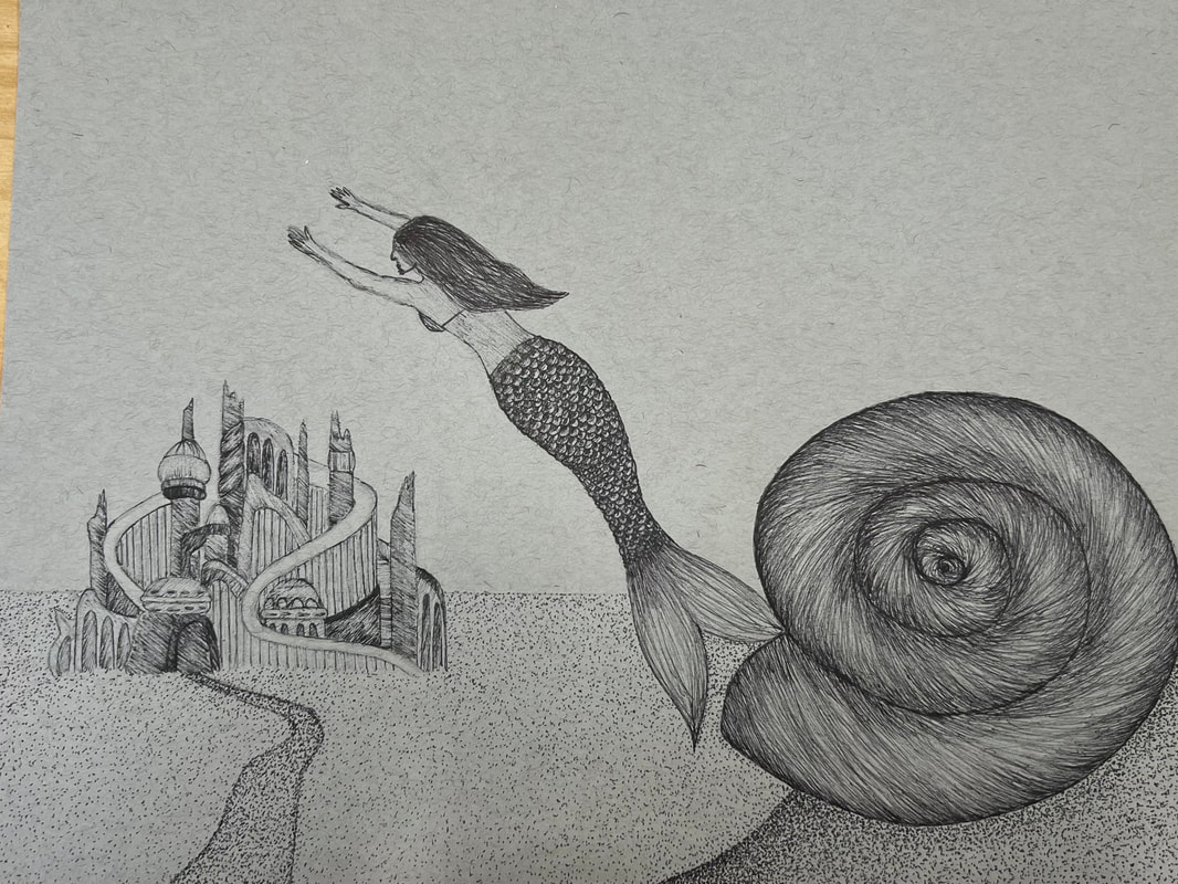
For my piece, I attempted to use a variety of pen and ink techniques such as stippling, hatching, and random line. I used stippling to imitate the texture of sand, hatching to create the texture of the spiral shell, and random line to add detail to the piece. I used forced perspective for the positioning of the shell to create the illusion that the mermaid is swimming out of it, while in reality, the shell is in the foreground, and the mermaid is in the middle ground. I also used one point perspective to draw the patterns of the ocean background to one corner, to represent sun rays streaming through the water. Using such perspective techniques was necessary to shape the story I wanted my piece to portray. The purpose of the sun rays drawing the mermaid to the surface is to depict the curiosity of Princess Ariel in the Little Mermaid. Texture was important in this piece because it created depth, rather then allowing the objects to look two dimensional. The pen and perspective practice completed in class prior to creating this piece were crucial in helping me shape my understanding of how to use and apply the various techniques I incorporated in my piece. If I could redo my piece, I would definitely take more time to carefully plan out the different patterns in my piece, as I feel that there are some sloppy lines, as well as trying to make some the lines/shapes cleaner. Overall, I am pretty happy with how this piece turned out and I have ultimately gained a better understanding of how I can attempt to use the techniques I have learned in the future.
For my piece, I attempted to use a variety of pen and ink techniques such as stippling, hatching, and random line. I used stippling to imitate the texture of sand, hatching to create the texture of the spiral shell, and random line to add detail to the piece. I used forced perspective for the positioning of the shell to create the illusion that the mermaid is swimming out of it, while in reality, the shell is in the foreground, and the mermaid is in the middle ground. I also used one point perspective to draw the patterns of the ocean background to one corner, to represent sun rays streaming through the water. Using such perspective techniques was necessary to shape the story I wanted my piece to portray. The purpose of the sun rays drawing the mermaid to the surface is to depict the curiosity of Princess Ariel in the Little Mermaid. Texture was important in this piece because it created depth, rather then allowing the objects to look two dimensional. The pen and perspective practice completed in class prior to creating this piece were crucial in helping me shape my understanding of how to use and apply the various techniques I incorporated in my piece. If I could redo my piece, I would definitely take more time to carefully plan out the different patterns in my piece, as I feel that there are some sloppy lines, as well as trying to make some the lines/shapes cleaner. Overall, I am pretty happy with how this piece turned out and I have ultimately gained a better understanding of how I can attempt to use the techniques I have learned in the future.
Colored Pencil

Colored Pencil Forms Practice:
For this assignment, I was instructed to draw three cones and three spheres, all with different colors and drawn on different colors of paper. I used Prisma colored pencils for all of these forms. I really enjoyed this assignment because it helped me get a better feel of how to create different levels of value with colored pencil, as well as how to blend colors together seamlessly. I think I did a pretty good job with these, however, I feel that the shadows on the spheres could have been more strategically placed to make the object seem more realistic.
For this assignment, I was instructed to draw three cones and three spheres, all with different colors and drawn on different colors of paper. I used Prisma colored pencils for all of these forms. I really enjoyed this assignment because it helped me get a better feel of how to create different levels of value with colored pencil, as well as how to blend colors together seamlessly. I think I did a pretty good job with these, however, I feel that the shadows on the spheres could have been more strategically placed to make the object seem more realistic.

Reference Photo
|

Colored Pencil Fruit/Veggie Drawing:
For my drawing, I chose to draw a green apple. I used the reference photo on the left to guide me in this process. This assignment helped me gain a better understanding of how to layer colors with color pencils and apply the techniques that I learned while doing the forms in an earlier assignment. Overall I am pretty happy with how this piece turned out. |
Paint

Creative Color Wheels:
For this assignment I had to create two creative color wheels representing the basic colors that can be derived from a set of cool tone primary colors (left) and a set of warm tone primary colors (right). I enjoyed this assignment because it helped me gain a better perspective of how regular primary colored paints can be used to create a vast array of colors. |

|

Reference Photo
|

Acrylic Paint Practice:
For this assignment I had to use acrylic paint to create a piece based off of a reference photo. This assignment was helpful for me to apply the color theory I learned from the color wheels, however, I am definitely missing a few elements in my piece. I did not follow the directions properly on this assignment as my background is a solid color, I forgot to include a shadow, and the overall painting lacks depth. I think that I rushed too much on this piece and if I had taken a little more time to carefully add detail, the piece would've turned out a lot better and would not look so two-dimensional. |

Landscape in the Style of a Famous Artist Acrylic Painting Brainstorming and Color Sketches

|

|

|
Progress #1 Progress #2 Progress #3

Landscape in the Style of a Famous Artist Acrylic Painting:
For this piece I was tasked to pick a famous artist, research their signature art style, and create a piece using concepts from their art style. I was inspired by Vincent Van Gogh's impressionist, vibrant, and whimsical style. I knew that I wanted to implement distinct brush strokes, vibrant colors, minimal blending, and movement in my piece. I think that my piece is pretty neat and crafted well. However, even though I like the look of my painting. I feel that I strayed too far from Van Gogh's style. The sky is in line but I don't think that the rest of the painting follows Van Gogh's style. I think that I may have blended the colors more than I needed to and did not create enough movement in the piece. If I had done so, I think that my piece would have been much closer to embody that of Van Gogh's infamous style. I think that my color choices reflect Van Gogh's work pretty well as I tried to incorporate much brighter tones so that the piece would be more eye catching. The style of the landscape represents Van Gogh as he often painted lots of fields, which is what inspired me to base my painting on a picture of a group of friends having a picnic in a large field. If Van Gogh were to see my painting today, I think that he would appreciate the attempt to mimic his complicated style and would suggest to add more contrasting colors to the piece to make it more exciting.
For this piece I was tasked to pick a famous artist, research their signature art style, and create a piece using concepts from their art style. I was inspired by Vincent Van Gogh's impressionist, vibrant, and whimsical style. I knew that I wanted to implement distinct brush strokes, vibrant colors, minimal blending, and movement in my piece. I think that my piece is pretty neat and crafted well. However, even though I like the look of my painting. I feel that I strayed too far from Van Gogh's style. The sky is in line but I don't think that the rest of the painting follows Van Gogh's style. I think that I may have blended the colors more than I needed to and did not create enough movement in the piece. If I had done so, I think that my piece would have been much closer to embody that of Van Gogh's infamous style. I think that my color choices reflect Van Gogh's work pretty well as I tried to incorporate much brighter tones so that the piece would be more eye catching. The style of the landscape represents Van Gogh as he often painted lots of fields, which is what inspired me to base my painting on a picture of a group of friends having a picnic in a large field. If Van Gogh were to see my painting today, I think that he would appreciate the attempt to mimic his complicated style and would suggest to add more contrasting colors to the piece to make it more exciting.
Clay

Pop Art Clay Food Brainstorming

Clay Sculpture Plan:
For my clay sculpture, I am choosing to create a stack of pancakes with blueberries on top. On the left is my color sketch. This is where I planned out what I want my piece to look like, and the colors I wish to incorporate. On the right is my my plan of how I want to sculpt my piece. I plan to use slabs for the actual pancakes, tiny spheres of clay for the blueberries, slip for the syrup, and a real plate to display the piece. |

|

Pop Art Food Clay Sculpture:
For this assignment, I was tasked to create an everyday food item out of clay. I am pretty happy with how my piece turned out and I would say the craftsmanship is pretty good. The most difficult part of this project for me was making the piece look as realistic as possible. I feel that if the pancakes had a smoother look, they would have looked more realistic and less lumpy. To make my piece, I used slabs of clay for the pancakes, which I rolled out with a rolling pin and shaped with my hands. Each layer was stuck together using slip. For the blueberries, I used my hands to create the round shape and then used a combination of my hands, slip, and clay tools to create the textured tops of the berries. I found that this was the best way to create a realistic looking blueberry. I think that my color choices were fine, but personally, I wish they were a little less vibrant, so that the piece would look a little more realistic. I think that my sculpture is interesting from all views because every angle looks different.the piece is not symmetrical so you can always observe something new in the piece when it is viewed from different angles. Constructing a sculpture in 3D is much different than something in 2D because you have to take into account every angle and make sure that all sides of the piece have detail and minimal flaws, This required a lot more patience and attention to detail to ensure that I had properly crafted this 3D piece. I created textures in my sculpture by using my hands to create some indents and rigid lines, as well as clay tools to create the more fine details. For example, I used a clay tool to poke tiny holes along the edges of each pancake to mimic the air bubbles that form around the edges of a pancake while they are cooking. I also used the clay tools to create the intricate detail in each blueberry, which I think helped make them look a lot more realistic. My previous research of pop artists helped me with this project as it gave me a better idea of how I could construct my piece and make it stand out. If I were to redo this project, I think that I would take more time to focus on my precision with each element in order to make the piece look even more realistic, as well as using more realistic colors for the food. Overall, I am pretty happy with the outcome of this project and I think that it was a great way to finish off the semester.
For this assignment, I was tasked to create an everyday food item out of clay. I am pretty happy with how my piece turned out and I would say the craftsmanship is pretty good. The most difficult part of this project for me was making the piece look as realistic as possible. I feel that if the pancakes had a smoother look, they would have looked more realistic and less lumpy. To make my piece, I used slabs of clay for the pancakes, which I rolled out with a rolling pin and shaped with my hands. Each layer was stuck together using slip. For the blueberries, I used my hands to create the round shape and then used a combination of my hands, slip, and clay tools to create the textured tops of the berries. I found that this was the best way to create a realistic looking blueberry. I think that my color choices were fine, but personally, I wish they were a little less vibrant, so that the piece would look a little more realistic. I think that my sculpture is interesting from all views because every angle looks different.the piece is not symmetrical so you can always observe something new in the piece when it is viewed from different angles. Constructing a sculpture in 3D is much different than something in 2D because you have to take into account every angle and make sure that all sides of the piece have detail and minimal flaws, This required a lot more patience and attention to detail to ensure that I had properly crafted this 3D piece. I created textures in my sculpture by using my hands to create some indents and rigid lines, as well as clay tools to create the more fine details. For example, I used a clay tool to poke tiny holes along the edges of each pancake to mimic the air bubbles that form around the edges of a pancake while they are cooking. I also used the clay tools to create the intricate detail in each blueberry, which I think helped make them look a lot more realistic. My previous research of pop artists helped me with this project as it gave me a better idea of how I could construct my piece and make it stand out. If I were to redo this project, I think that I would take more time to focus on my precision with each element in order to make the piece look even more realistic, as well as using more realistic colors for the food. Overall, I am pretty happy with the outcome of this project and I think that it was a great way to finish off the semester.
